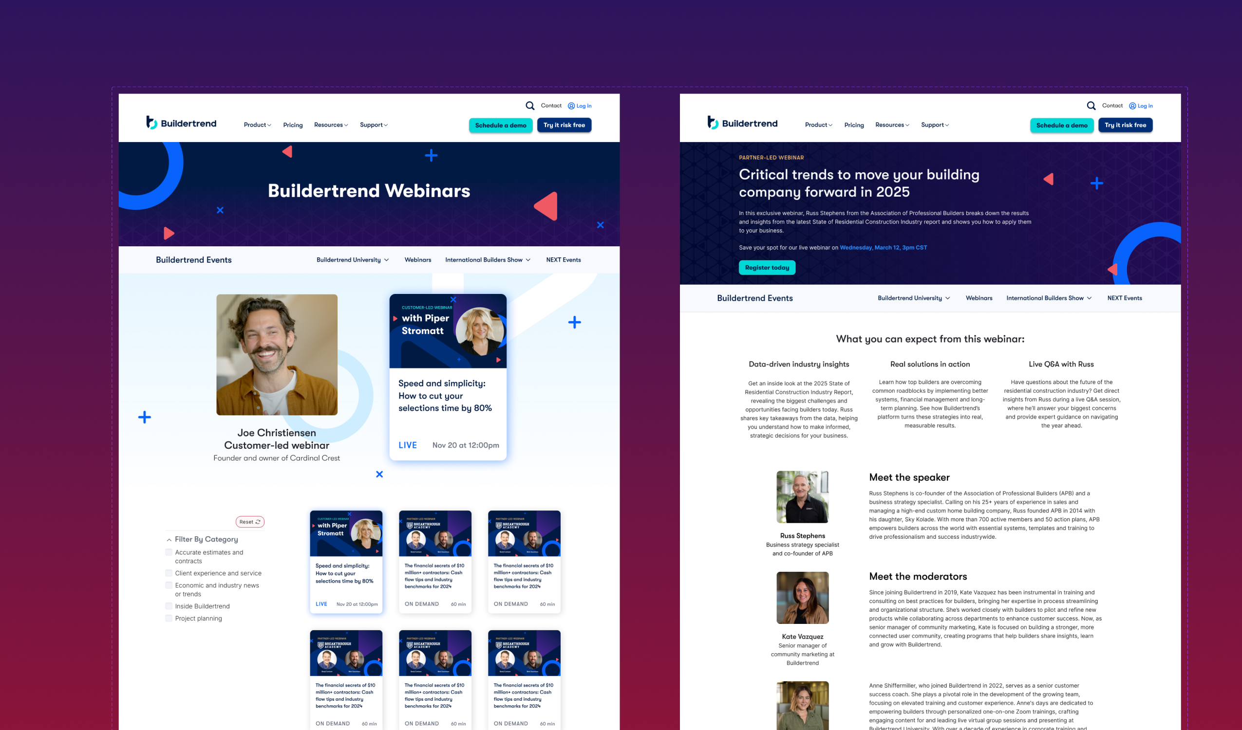
Builder focused webinar rebrand
This reimagined webinar series brings a fresh, tech-forward look that makes the content truly stand out. By using the secondary brand colors – purple, red and coral instead of teal and blue – this is a series that can stand on its own. Dynamic patterns and subtle gradients bring a simple yet elevated feel of professionalism.
This approach makes our webinars instantly recognizable when customers are scrolling through their cluttered feeds and inboxes, while positioning our content as high-quality thought leadership that has its own distinct personality within our broader brand world.