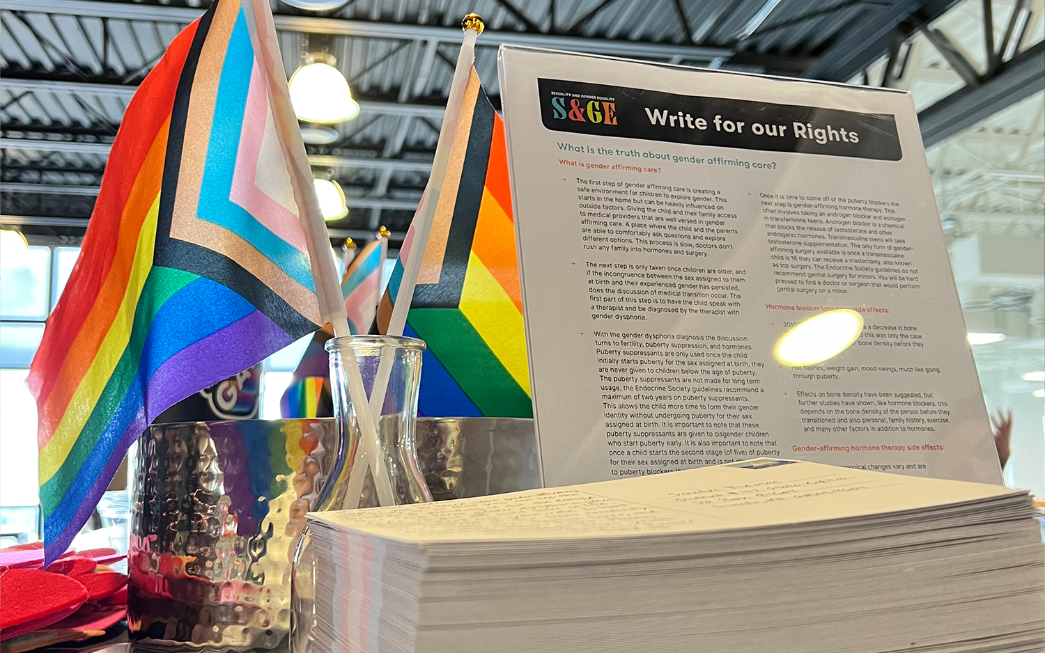
PURPOSE
Build a logo and branding for an employee resource group that supports the LGBTQIIA+ community. The design features the acronym SAGE which stands for Sexuality and Gender Equality. The ampersand replaces the A in simple designs to symbolize the inclusion of all gender expressions.
CHALLENGE
Branding a new ERG is difficult because you need to keep in mind many different perspectives and try to build for future designs. I created a simple letter form that can be used in full color, one color, or with the ampersand as a mark. Most of the designs are in a digital space, so the bright colors help to call attention to the important mission. The color palette blends the internal and external brands for a perfect marriage of employee work and personal life.