Cupcake Kati
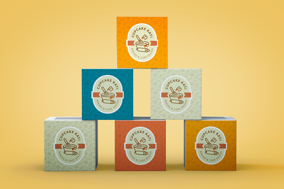
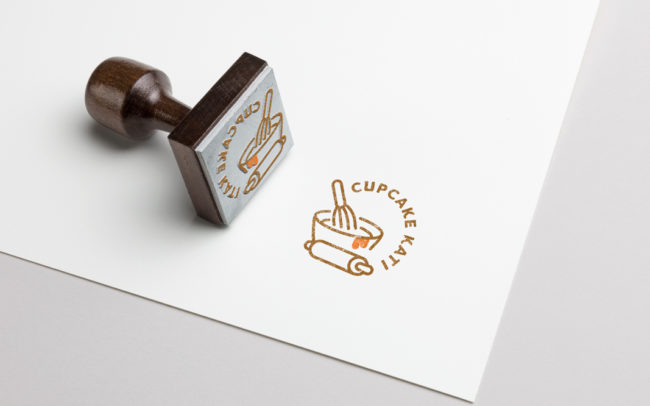
I created a new logo and brand guide for Cupcake Kati’s pastry brand, with two versions suited for stickers and stamps. The color palette is inspired by her favorite honey hue—bright yet sophisticated. Since she has added more pastries and treats to the menu, a broader visual identity was needed- hence the incorporation of baking tools instead of just a cupcake like the name.


