PURPOSE
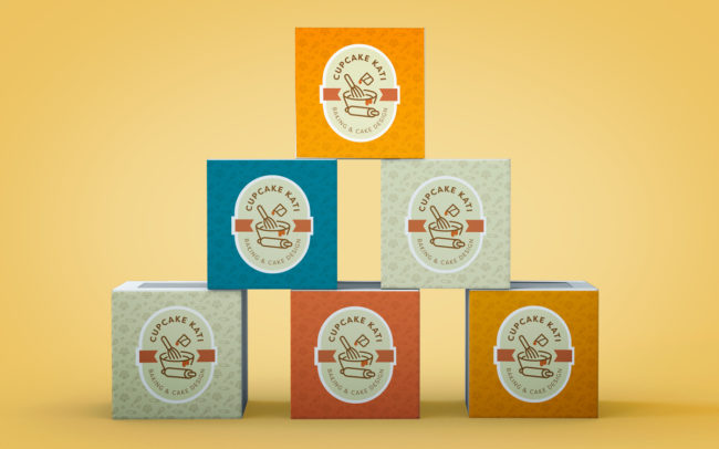
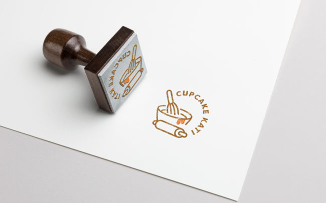
New logo and design standards for Cupcake Kati’s pastry brand. The two versions of the logo are designed for use as a sticker and stamp.
CHALLENGE
The color palette is based on the honey color which is her favorite. It needed to be bright without looking too childish. Originally the name was based on the sole product but after expanding to other baked goods an image with only a cupcake didn’t fit anymore. The baking tools represent the homemade quality and fun spirit.


