CBUSA brand refresh
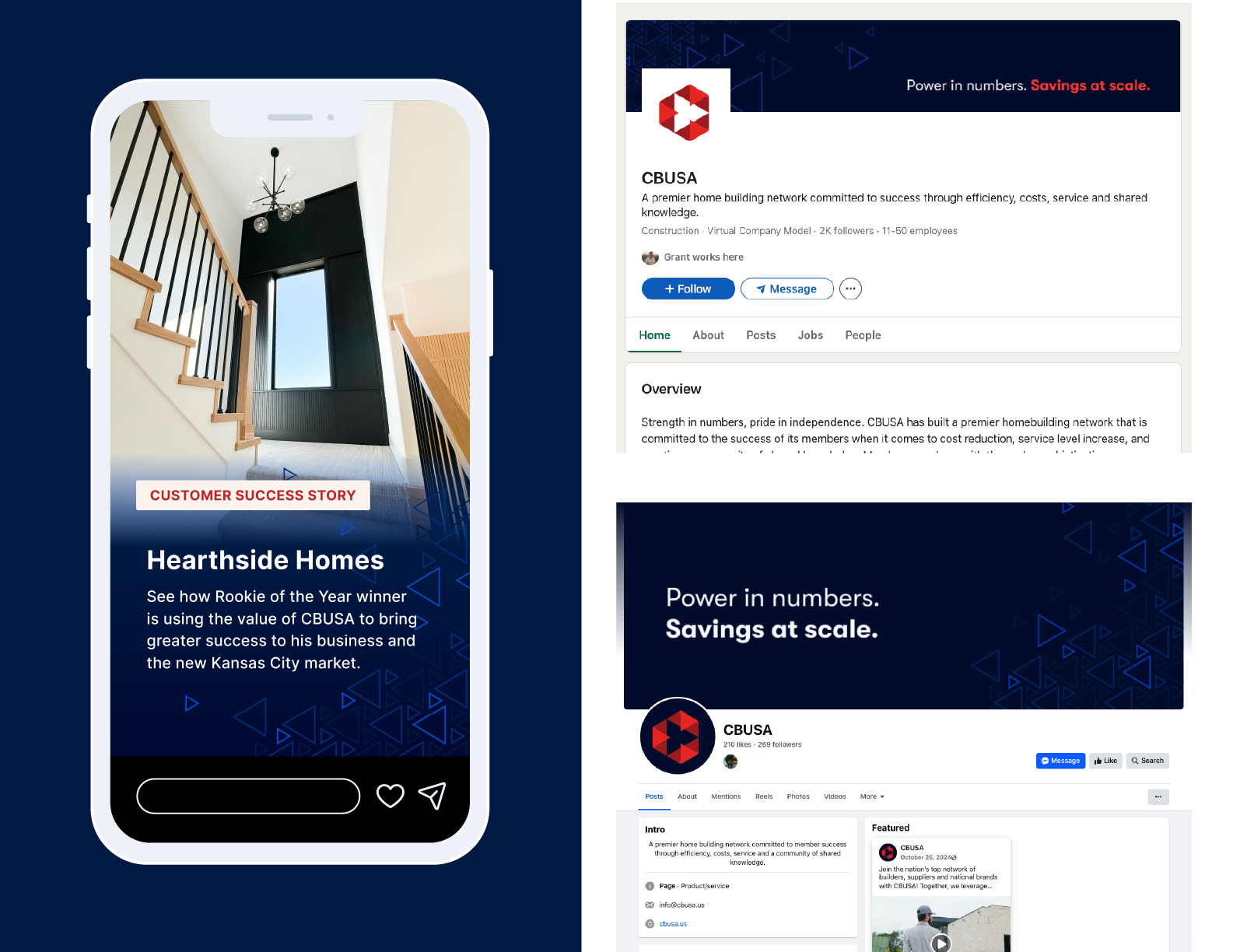
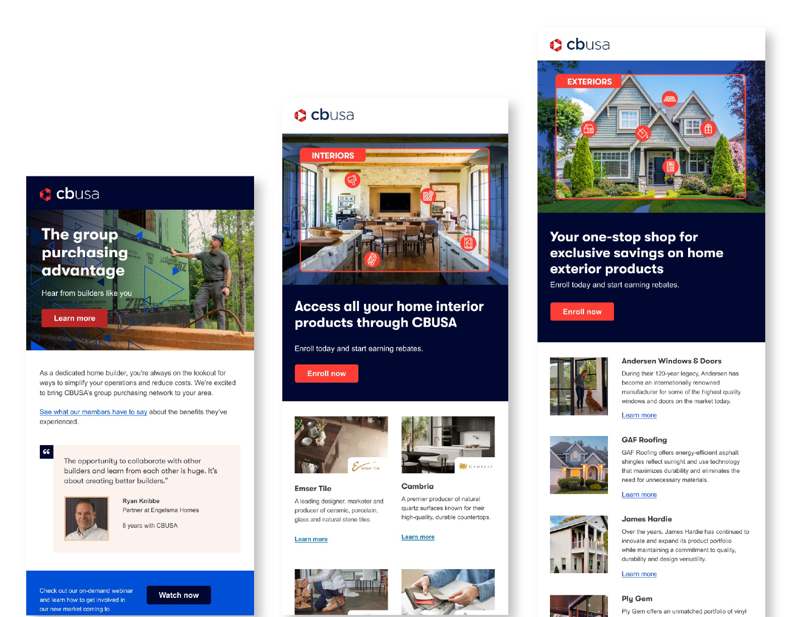
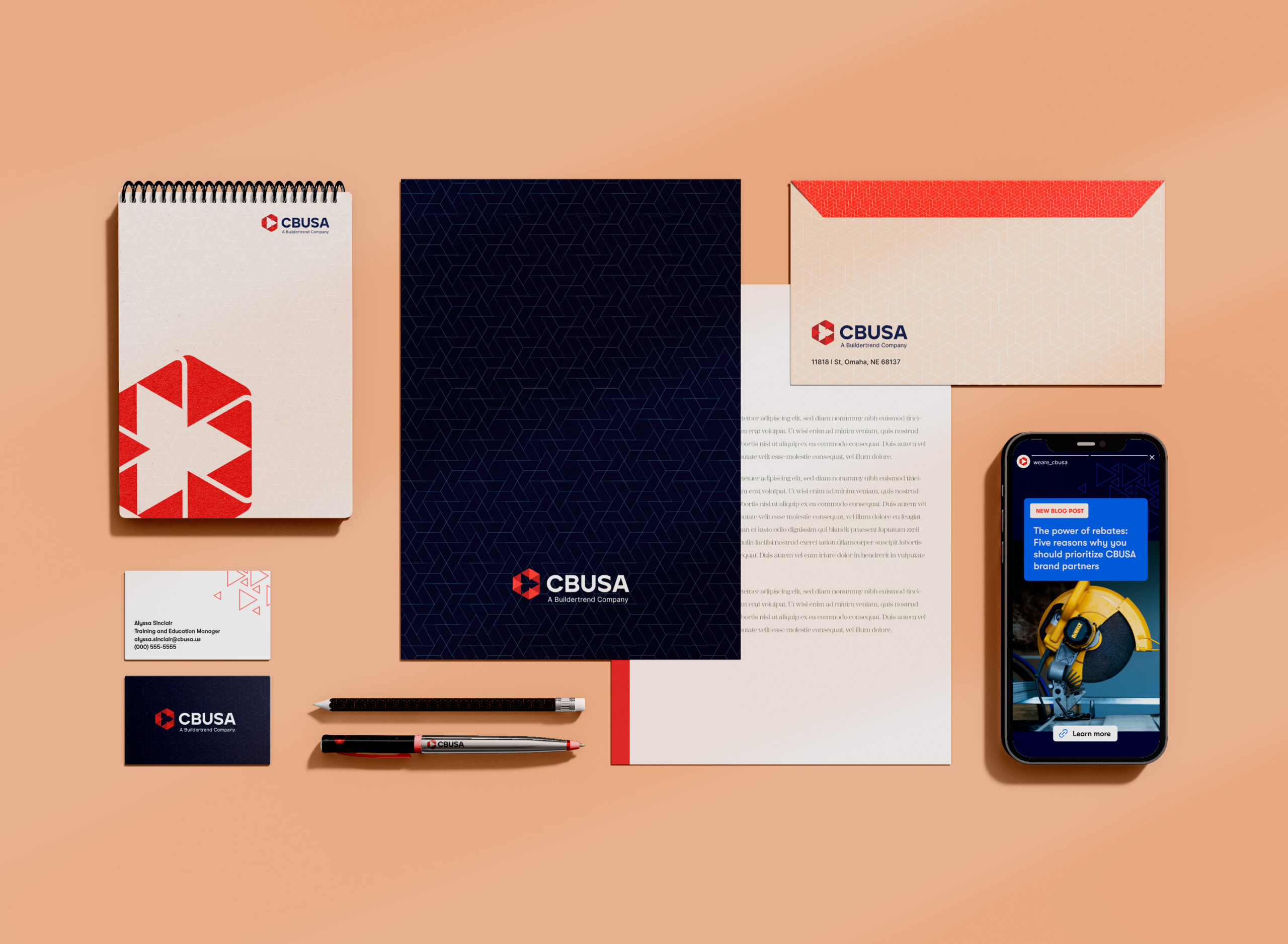
This national brand refresh for CBUSA aimed to communicate the company’s strong core values and direction while staying true to its foundation. With a specialized customer base, the challenge was to craft colors, patterns, and photography that aligned with their trade. Patterns inspired by building materials add texture and depth, visually connecting our brand to the industry we serve. Real customer photography replaces stock imagery, showcasing authentic professionals and their work. The goal was to evolve the visual identity—honoring the brand’s core while introducing fresh energy. More than just an aesthetic update, this refresh reimagined the brand’s story and purpose, ensuring it resonates with both its legacy and the future it seeks to build.
CBUSA’s refreshed brand voice is knowledgeable, approachable, and forward-thinking. The goal is to communicate with clarity and confidence, ensuring our audience feels informed and empowered.

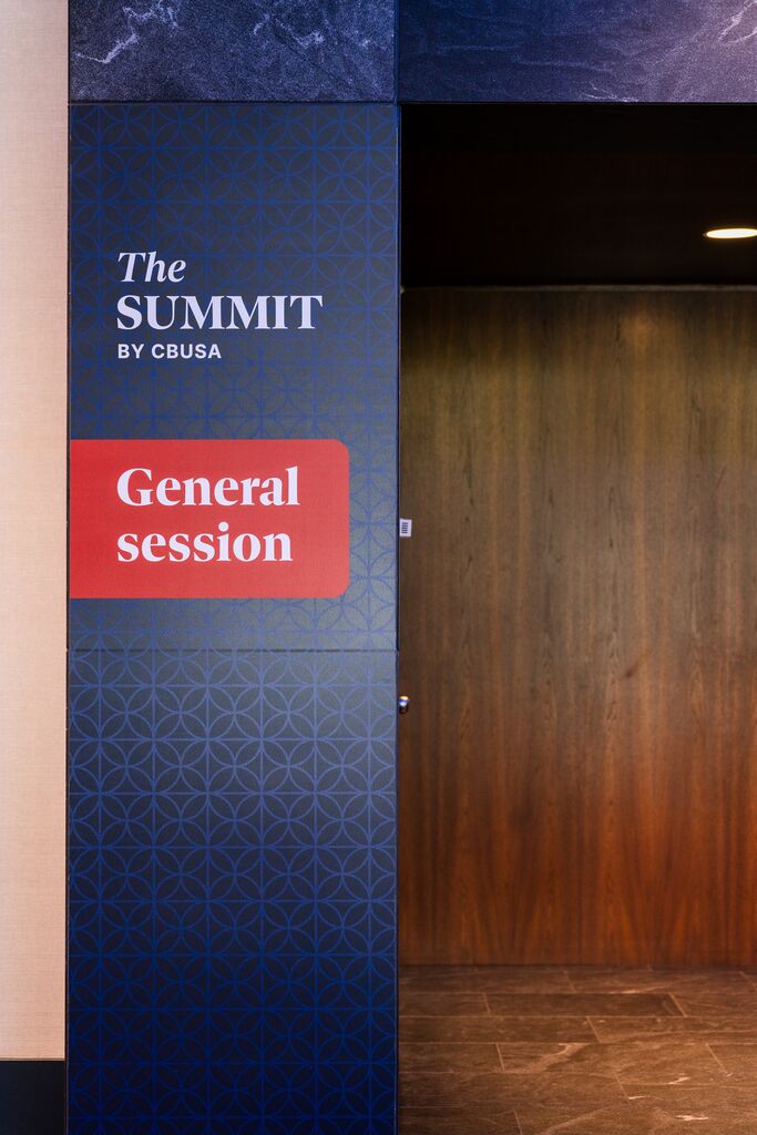
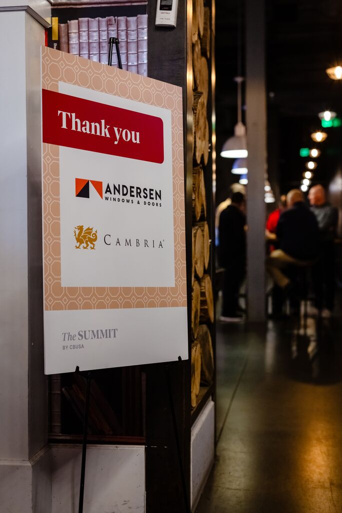
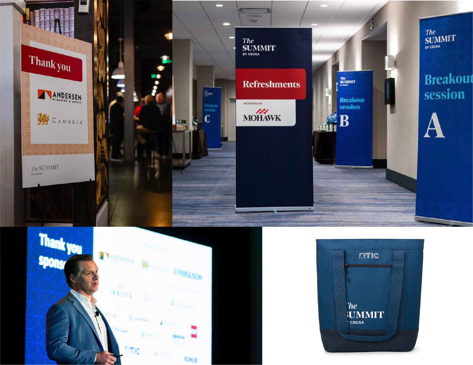
This conference was an exciting opportunity to use the new CBUSA branding on a larger scale. The event uses the new colors, patterns and overall look. After the event wrapped up I took the feedback from users to make updates to the brand to finalize the look.